Email Newsletter Templates: 7 Tools That Design and Send Them
A newsletter template lives inside the tool that sends it, so picking one means picking the other. I compared seven tools on templates, free plans and price, and I say which one I use.
You found a newsletter layout you liked. Clean header, one good photo, a divider that doesn’t look like a 2009 sales blast. You saved the pin, went looking for the file, and there wasn’t one.
An email newsletter template isn’t a file. It’s a saved layout inside the platform that sends your email. The drag-and-drop editor, the font menu and the mobile preview all belong to that one tool, and if you switch tools later, your layout stays behind.
So picking a template and picking a sending tool are the same decision. You might as well make it once.
What a template controls
A template sets the structure of an email: the number of columns, where the header sits, whether images run edge to edge, and how much space separates each section. It sets the defaults for fonts, heading sizes and buttons. It also decides how the email behaves on a phone, and that part counts most, because a large share of your readers will open it there. A layout built for a desktop screen tends to arrive on a phone as a tall column of oversized text.
Some things sit outside a template’s reach. It can’t decide whether your email lands in the inbox or the promotions tab; your sending reputation decides that, and the platform manages it. It can’t make a thin email feel substantial. And it won’t move with you. Export your list to another tool and your subscribers come along, but your layout doesn’t.
When I compare tools, I ask one question: which editor would I be happy to open every week for a year?
1. MailerLite
- Free plan: up to 250 subscribers and 2,500 emails a month
- Paid plans: from $12 a month
- Best for: a newsletter you want to look designed
- Downside: new accounts need approval before they can send
MailerLite is what I use for this site. Its editor is drag and drop, and the template gallery is the first thing you see, so you can choose a layout before you write a word. Swap in your text and photos and the email holds together on a phone without extra work. The signup form, a landing page for that form, and a welcome email for new subscribers all live in the same account.
The free plan is the smallest among the big names here. 250 subscribers will cover a new newsletter for its first months, but a list that grows will need a paid plan sooner than it would with Kit.
Plan ahead for the approval step. MailerLite reviews new accounts before letting them send, and the review looks at your website. Put a few real pages on your site and get your signup form working before you apply.
2. Kit
- Free plan: up to 10,000 subscribers
- Paid plans: from $33 a month, billed yearly
- Best for: writers who plan to sell something later
- Downside: few visual templates, on purpose
Kit, which used to be called ConvertKit, takes the opposite approach to MailerLite. Its emails look plain and put the words first, on the theory that an email that looks like a person wrote it gets read more than one that looks like a campaign. The templates match that idea: a header, your words, a button.
Kit puts its effort into subscriber data. It tags people by what they click and lets you send different sequences to different groups, which pays off the day you launch a course or a paid tier. Automated sequences and the deeper reports come with the paid plans.
Its free plan is the largest on this list by a wide margin. If you’re not sure your newsletter will last, that’s a good reason to start here. If you came for templates, the gallery will feel thin.
3. beehiiv
- Free plan: up to 2,500 subscribers
- Paid plans: from $49 a month, billed yearly
- Best for: treating the newsletter as the product itself
- Downside: less design control than MailerLite
beehiiv was built for newsletters from day one. Its dashboard leads with growth: subscriber charts, a referral program, a network where other newsletters recommend yours, and ad tools for when you want sponsors.
Going by its template gallery, the layouts share a house style you’ll recognize once you’ve seen a few. That works if you like the look and gets in the way if you want yours to stand apart. The jump from the free plan to the first paid plan is the steepest of the seven.
4. Substack
- Free plan: free to send; Substack takes a percentage of paid subscriptions
- Best for: getting started this week
- Downside: almost no control over design
Substack removes setup. You sign up, write and hit send, and your archive turns into a public website with nothing to configure. Paid subscriptions are built in, so charging readers takes one setting.
You pay for that ease in control. Design comes down to a font and an accent color. Your archive lives on Substack’s domain by default and inside its recommendation network, which brings in readers early and makes leaving harder later. You can export your email list any time. Your readers’ habit of reading you on Substack doesn’t come with it.
5. Buttondown
- Free plan: your first 100 subscribers
- Paid plans: priced by list size, with add-ons from $9 a month
- Best for: writers who want no editor at all
- Downside: no visual templates, by design
Buttondown is small on purpose. You write in Markdown, it sends, and the email arrives looking like text with a link at the bottom. There’s no drag-and-drop editor to learn.
If you’re reading a post about templates, it probably isn’t your tool. I’ve kept it on the list because some people start out looking for a template and find out they wanted a plain, fast way to send words.
6. Mailchimp
- Free plan: up to 250 contacts and 500 sends a month
- Paid plans: priced by the number of contacts
- Best for: people who want every option available
- Downside: the bill climbs fast as your list grows
Mailchimp has the biggest template library here, along with the most mature tools around it: audience segments, A/B tests, landing pages and scheduling. If a layout exists, Mailchimp has some version of it.
It was built for marketing teams, and you’ll feel that when you’re the only person learning it. Because pricing follows your contact count, the bill goes up right when your newsletter starts to work. A few hundred contacts costs little. Several thousand costs a lot more.
7. Ghost
- Free plan: none on Ghost’s own hosting; the software is open source and free to run on your own server
- Paid plans: Ghost(Pro) from $18 a month for up to 1,000 members
- Best for: running a website and a newsletter from one place
- Downside: hosting it yourself takes real work
Ghost is a publishing platform that also sends email. Each post becomes a page on your site and an email in your readers’ inboxes, and paid memberships are built in.
Running Ghost yourself means looking after a server, updates, backups and email delivery settings. The managed plan handles all of that for a price close to the others here. Changing the email design means editing code.
Template depth at a glance
| Tool | Visual template gallery | Editor | Best suited to |
|---|---|---|---|
| MailerLite | Deep | Drag and drop | Designed newsletters |
| Kit | Thin, on purpose | Light visual editor | Words first |
| beehiiv | Moderate, house style | Block editor | Newsletters built for growth |
| Substack | Minimal | Writing surface | Starting without setup |
| Buttondown | None | Markdown | Writers who want no editor |
| Mailchimp | Largest | Drag and drop | Having every option |
| Ghost | Moderate, code-heavy | Post editor | Site and newsletter together |
How to make any template look less like a template
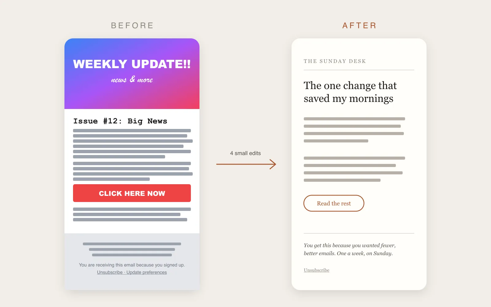
Most generic-looking newsletters share four problems, and every editor above can fix them in a few minutes. The image at the top of this post shows one newsletter before and after these four edits.
Use one font. Most gallery templates pair a display font for headings with a second font for body text, and a button often sneaks in a third. One font in two weights looks more deliberate than three fonts arranged with care.
Delete the stock header image. That banner pushes your first sentence below the fold on a phone, and your first sentence decides whether anyone reads the rest. Swap in something you made, or remove it and open with words.
Add space and shorten your lines. Templates ship tight because tight layouts screenshot well. Add space above and below each section, and keep lines short so the eye doesn’t have to travel far. Of the four fixes, this one changes how finished an email feels the most.
Write your own footer. A default footer tells readers nobody edited the email. Write one plain line about who you are and why this lands in their inbox. Keep the unsubscribe link where people can find it, which in most countries is also the law.
Your first issue will take an hour because you’re making all these decisions. By the tenth, the layout takes ten minutes and the writing gets the rest of your time.
Set these up before your first send
Whichever tool you choose, three settings shape how your first email lands.
A sender address on your own domain. Send from something like hello@yourdomain.com instead of a free Gmail address. Inbox providers trust a domain you’ve verified, and readers recognize your name. This site sends from hello@onepersondesk.com, and most tools on this list walk you through verifying a domain. Substack is the exception: it sends from its own address.
A welcome email. New subscribers are most interested in the minutes after they sign up. A short note that says what they’ll get and how often costs you fifteen minutes to write once and runs for every new reader after that.
Double opt-in. This asks new subscribers to confirm by clicking a link. You’ll lose a few signups, and you’ll keep typos and fake addresses off your list, which protects your sending reputation.
Which one should you pick?
You want a designed newsletter. Go with MailerLite. The template gallery is the reason to choose it, and paid plans start low once you pass 250 subscribers. Get your site ready before you apply for an account.
You write mostly words and plan to sell something. Kit fits. You give up visual templates and get subscriber tagging that makes a launch easier, plus the largest free plan here.
You haven’t started yet. Try Substack. Its design limits won’t matter for your first twenty issues. Send something, find out whether you enjoy it, and move later if you do.
The other four suit narrower cases. beehiiv fits if growth tools excite you. Buttondown fits writers who saw themselves in its description. Mailchimp makes sense if you already use it. Ghost fits when your website matters as much as your email.
Before you sign up
Open each tool’s template gallery before you create an account. Skip the three polished examples on the sales page and look at the gallery itself. Some go deep. Others offer one layout in six colors. Ten minutes of browsing will tell you more than any comparison, this one included.
Prices and free plans change, free plans most of all, so check each pricing page before you commit.
Then start on a free plan. Six of these seven tools have one, and Ghost costs nothing if you host it yourself. A week of writing in an editor shows you something a feature list can’t: whether you’ll want to open it again next week.